I hope to see and meet many of you at Bangor’s October 1st Friday ARTWALK! Masks required and a chance to ask questions about this exhibition and my Artwork in general.
-Peter
SOHNS GALLERY - 36 Central Street, Bangor-Maine
I hope to see and meet many of you at Bangor’s October 1st Friday ARTWALK! Masks required and a chance to ask questions about this exhibition and my Artwork in general.
-Peter

SOHNS GALLERY - 36 Central Street, Bangor-Maine

2021 could not have been any crazier it seems with the continuation of Covid issues and concerns. I was able to hang this exhibition in Bangor last week with help of my friend Kirk Linder and clear the studio of the last of the “Big” covid projects. A sense of relief and the beginning of what may Artists dread- “What next”?!
I will not say much here except show some images from the installation and my Artist Statement. I must thank Annette Dodd at Sohns for trusting me and letting me do this my way. Enjoy- Peter

This whole Pandemic thing has me “awaiting the second shoe to drop” and I know many of you are listening for it too. The Pandemic hit hard and fast. It forced us to rethink what and who we are, where we live, and how we relate to one another. One thing I did pay close attention to was the retreat from “hot spots”, from cities, from the fear of contracting an illness not fully understood. I observed Maine as it quickly began to fill with vehicles from near and far with the many many passengers all looking to find space to breathe, looking to locate and claim their 6 feet of personal landscape.
RETREAT
an act of moving back or withdrawing.
a quiet or secluded place in which one can rest and relax.
a period of seclusion for the purposes of prayer and meditation.
retreat Shape of Land, Shape of Water
I too retreated- Sometimes by car but mostly by turning inward and drawing upon memory of landscape(s) and “Places I have been”. The daily act of painting these landscapes in small watercolors eased my internal worries during the lockdown- This is and always has been my medicine.
Eventually these cerebral retreats to the landscape paintings became larger and more intense, now painting on scrap plywood, cutting away the detritus, shaping my own personal landscapes. Each work began to have their own personalities and were obviously fragments of something larger in my mind. Back when I was a graduate student in Baton Rouge, in the 1990s, our Print-workshop was delegated to a small, dark, below grade space shared with what was then and now an underused, quite dusty, yet alluring Natural History Museum. I would spend countless hours in the museum drawing inspiration and creating Artwork based upon these collected and catalogued “windows to the natural world”. These memories inspired this current thought of putting together, curating, these Pandemic fragments, not unlike the museum displays I remember so well. I offer up this exhibition as a glimpse into MY Pandemic retreat and what it has taught me thus far. Peter Walls 2021
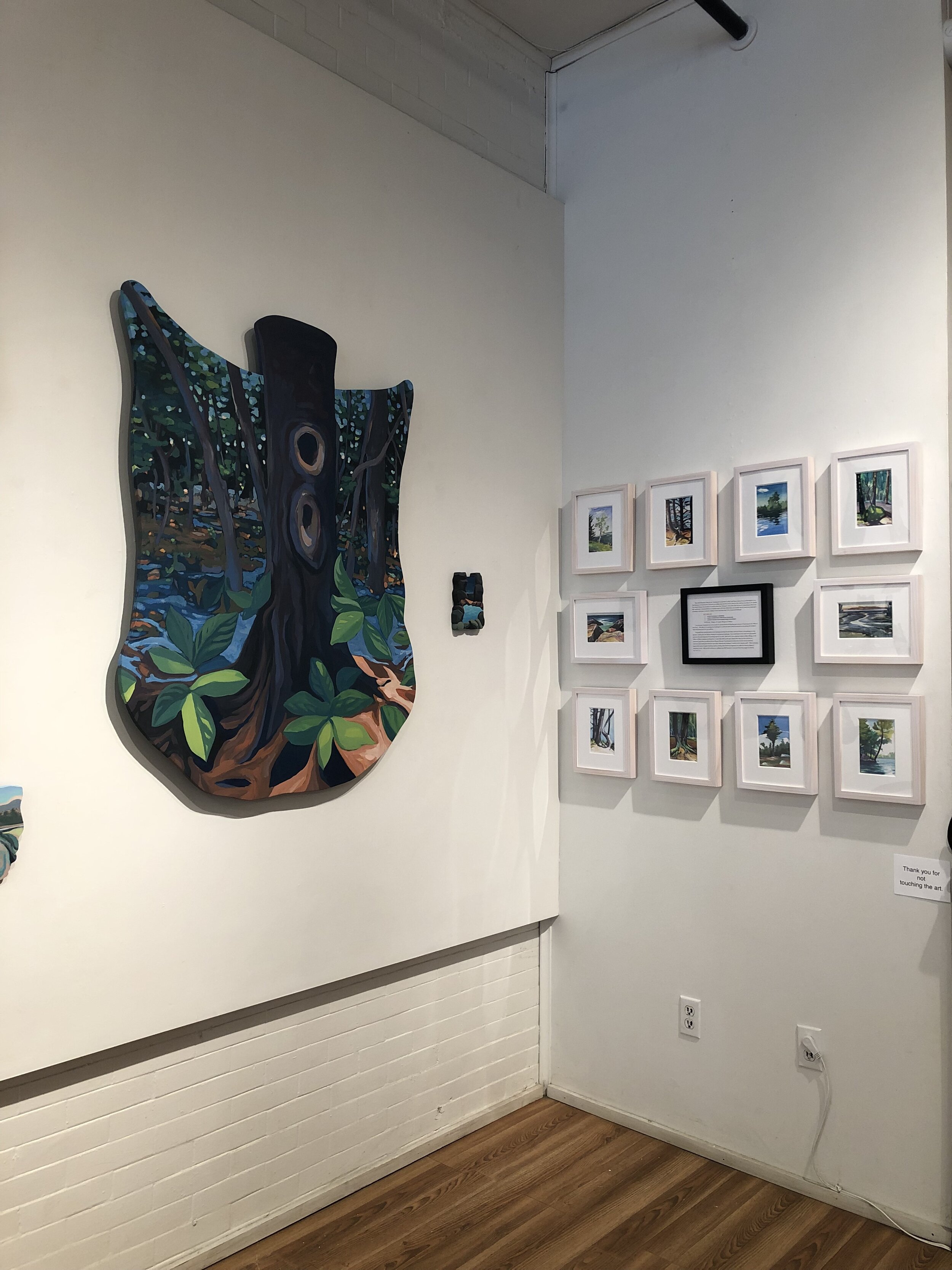
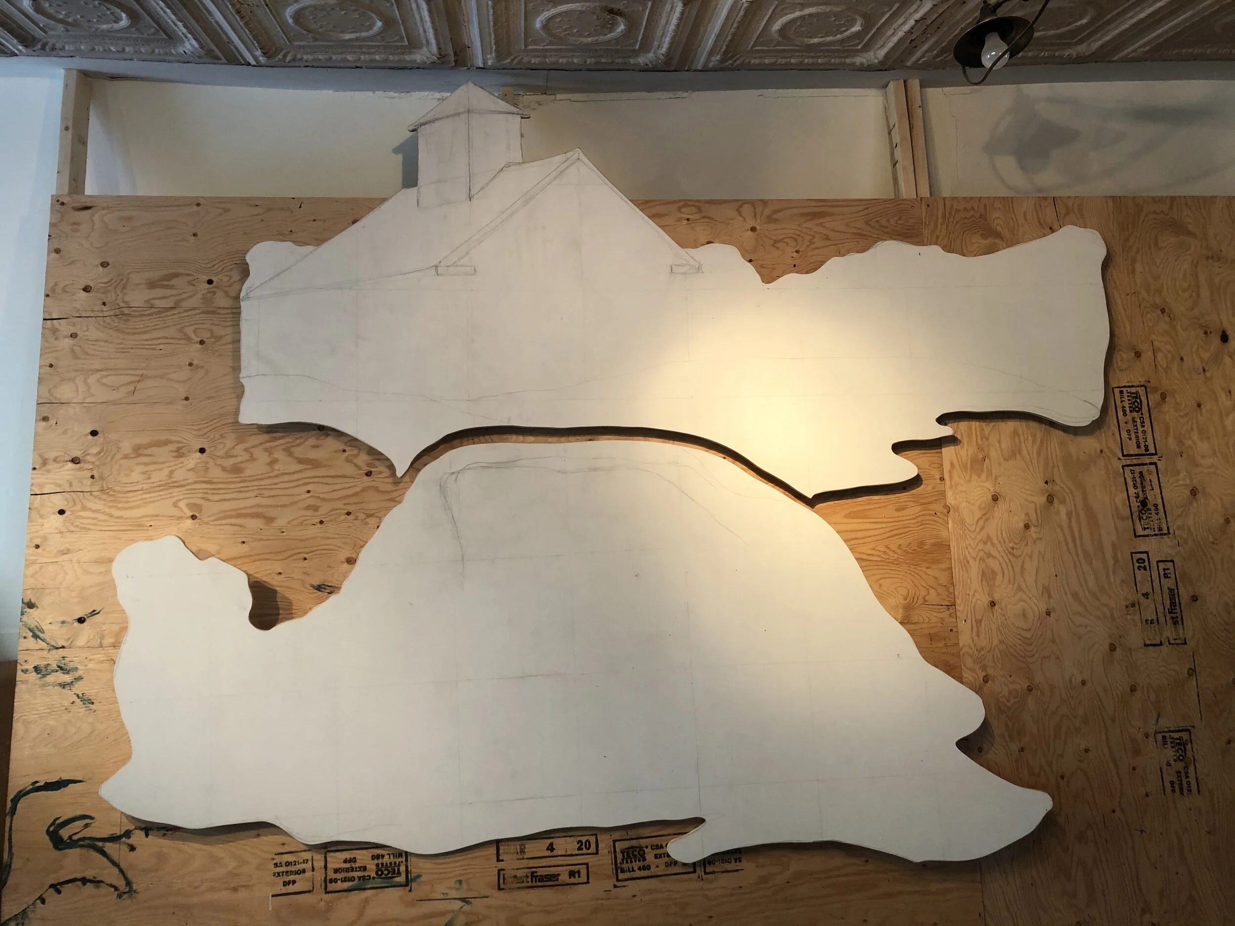
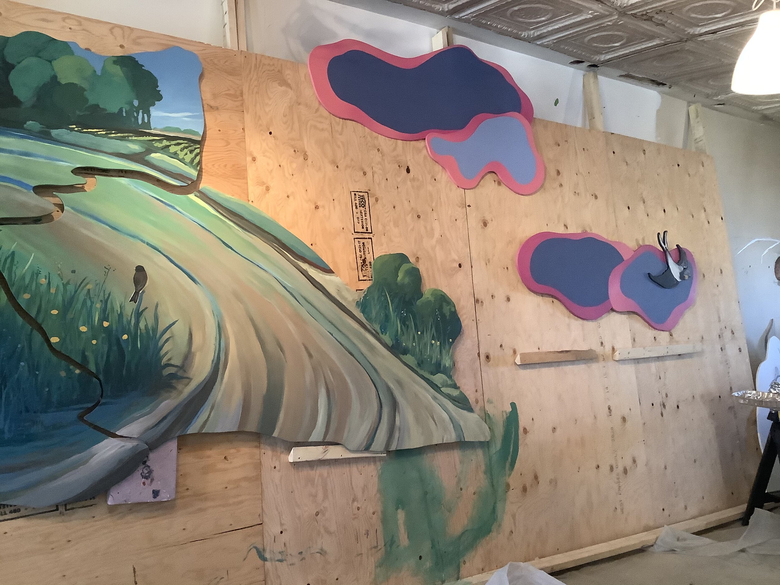
RETREAT•retreat - A 4.5’ end wall became the focal point for the text and the watercolors that began , and continue, this project.
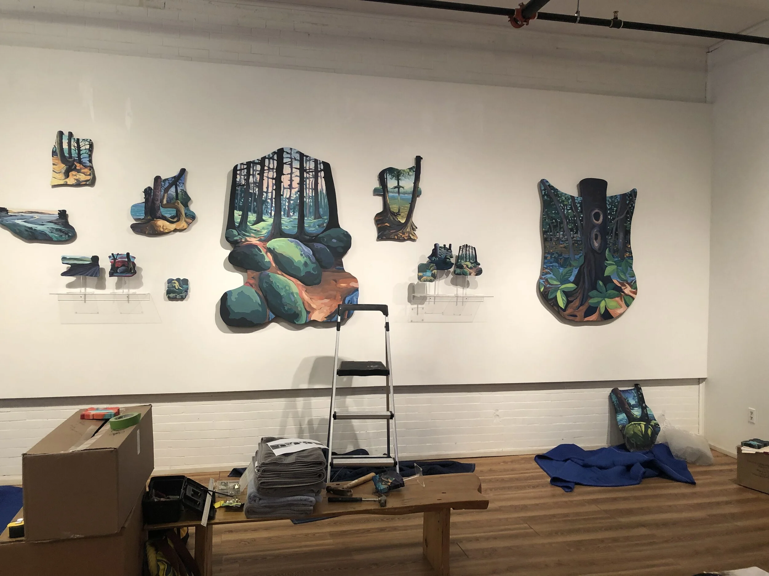
RETREAT•retreat - Installation in progress.
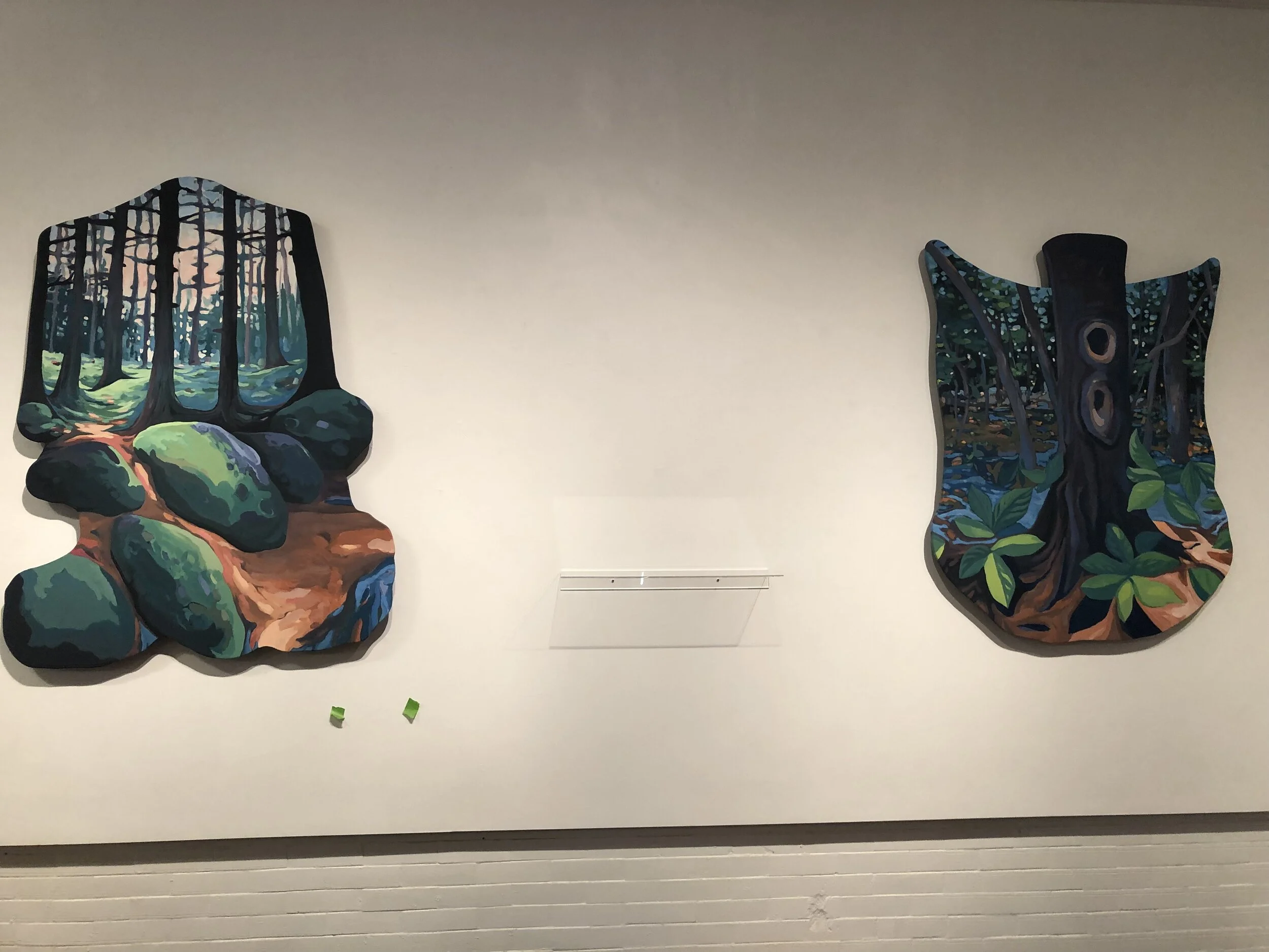
RETREAT•retreat - Installation in progress.

RETREAT•retreat - Installation in progress.

Lots have happened on this project since Part I- This is about the Painting itself though and we will look at the frame resolution the next time around.
The challenge of painting a Large Landcape painting with a client in mind, and their voices in your ear is interesting one. My usual color choices, mark making, and way of working were challenged and I learned much from this shift. They were looking for a painting, 12’ wide mind you, that captured the feeling of their view from South Bristol looking out and through the trees to the Ocean. They view was so expansive and in the vein of the Hudson Landscape School that I was a bit overwhelmed at first but quickly studied, sketched, and positioned my composition and approach. I had done a small test painting that they approved, a summer romantic view if you will, and my first drawings used this as a guide.

Composition First
My First drawings tried to capture the sweeping view and great expanse at hand. The difficult part being the two end panels and how they dipped below. ( This piece is framed to go around the clients bed as a “headboard” ).
I believed I was on the path to success but collaborations are NEVER that straight forward. Our “Art” language was very different and it took awhile to understand what their expectations were and for me to explain my process, how I work and make Art. I will say Covid did not help this process one bit as the normal one-on-one time was limited and those masks- Oh those masks!
After 2 months of preparatory drawings and preparing the panels the image shifted via the clients request to a winter scene as the trees had lost their leaves and they had felt a change of heart and a shift in their vision for the project. And that was fine as the goal of the drawings is to map out the painting and as long as I had not started applying paint yet all was good.

A Winter Scene
The shift to a winter scene too a bit of adjustment, but I was happy with he start of it.
Anyone that knows me knows the palette of this piece is NOT my usual approach to image making, but I LOVE a challenge and what it brings to my work. Limiting my colors and deciding to use metallic pigments to work along with the gilded panels I set off into a winter wonderland. I did try to use hints of color that one only sees upon close inspection; The purple and blue hues in the snow, the pinkish wash of a sunrise, and the cool blue whites of the moonlit night.
Alas, things changed again midway through the painting and this was a bit more difficult to adjust, but everything is doable with paint + brush! That said I hate showing pieces half completed as I myself know where I believe the work is headed but the viewer, and client in this case, sees and thinks with a different set of eyes and their end vision rarely lines up with the midway point. The long and short of it was a change of the whole composition; The horizon line raised by 5+ inches, the shift of the whole composition to the left by over 12” and a whole new thought about the two outside panels. Instead of freaking out I charged ahead and worked for 2 weeks non-stop to create the new composition. Best to get it to its new place quickly before I or the clients question the change.

The top is where we were and the bottom where we landed after a 2 WEEK Intensive painting session.
They wanted more of a “through the trees” feel and a recent Moon Shadow night at their home was inspiration for the right half of the painting while still keeping the sunrise on the left- A 12’ wide composition can handle that though and I am extremely happy with the result as it tells a story that otherwise would not have happened.
I was also pleasantly surprised with how this helped resolve the two outside panels and the foreground. Looking at the Hudson River School and particularly the Tonalists- (Innes in particular) helped the clients and I speak the same language. Sometimes it takes time to get to this point and I love the journey.

The sunrise side gives a feeling of exhalation and warmth.

The Moon Shadow night side has a wonderful mysterious feel.
So, next is installation! To be continued . . . .. . .
I have been fortunate enough to have been working in this home, on and off, for over a year now. Built in 1929 on the shores of Lake Sunapee and designed by architect Prentice Sanger this home is quintessential lakeside lodge living and the new owners have been respectfully updating the home and grounds with my friend and designer Cicely of Cicely Beston Interior Design..

On-site day one with the trim in place, unstained, and the walls primed. The approved sample board shows the quiet golden ochre plaster finish with the raised colorful designs that will be worked on over the next week.

As has happened more and more- Especially due to 2020 Covid- I work remotely with clients for many months sending pictures and samples boards back and forth, talking on the phone, and finalizing a plan so that arrival on-site is productive, efficient, and safe.
The image above of the space in progress helped me think about scale of the designs. Also, I know the house well enough by now to understand the gestalt and direction the owners wished to pursue. The sample below was one of three “to scale” samples sent and approved- This allows me to mix my “mud” and cut stencils before arriving on site.

This technique has been something I have worked on for years and learned much from my original teacher and business partner Christy Diniz Liffmann in Baton Rouge and also Denise Welch-May in Vermont who did a variation of the finish using stencils for furniture designs. Combining the wall and furniture techniques this was the first opportunity to scale up the process and work on a whole room-

The woodworking and metal details in this home are incredible! The set the precedent for what Cicely and I considered for design in the space.

A view from above the Large two story Grand Living Room- Old school Lake lodge feel.

The fireplace hood I completed on my first time here. Working with J.A. Metaklcraft we made the fireplace “fit".
A dark green/gray primer and plaster base coat are then worked over with three colors to create a beautifully aged plaster wall that is then embellished with overcalled stencils that I have hand drawn + cut in the studio. I create 3-5 sets of the stencils as the corners and odd junctions of beams, wall, and trim will need some cut to fit out the space correctly.
For this room I am using a red base that is stenciled on carefully. I don’t lay things out but let the room speak to me to create a flow and composition that is NOT wallpaper. This creates a one of a kind finish that will never be seen anywhere else. The most difficult part is to clean and dry the stencils as I work.
I then hand paint the designs with the colors Cicely and I have carefully chosen- Then lightly sanding back to reveal some of the the red beneath making for an incredibly depth and sense of history.

I lay out the design organically using a red plaster mixed to imitate a red bole traditionally used for gold leaf.

Handpainting the design takes time and patience and much thought about color composition. I relate to this to textile design in my mind as I am working.
A sense of flow and whimsy is kept in mind- I was thinking of a “Garden Party” feel as you walk into the home and then through to the great room with sweeping views of Lake Sunapee and Mount Sunapee ! I was very happy with Cicely’s lighting secretion as it tied into the organic design and also the period of the home.

I carefully taped the woodwork as it has not been stained yet. I normally am the last person on the project but timing did not allow that this time. A bit more time consuming but worth the effort and respect for the painter/stainer who will CAREFULLY work behind my work.

After a light sanding of the hand painted layer the walls are sealed and allowed too dry for 24 hours before a very sheer umber glaze is applied that lightly ages and ties the feel to the woodwork. The goal is to embed the work in the space so that it feels as if it was always here, not a 2021 addition. I will say that I am anxious about the staining of the lower woodwork and will update this when complete and I get to go back for pictures. In all I am very happy with the finished product and had a great farewell talk with the clients as I finished packing for my journey back to Maine-

Once the glaze is applied I pull back the blue+gtreen tape and do small brush touch-ups as there are always some surprises behind the tape and in the tight corners, but again this is all part of the process.

Digital sketch for Stockton Springs Library Sign. 2020.
Here in Stockton Springs we LOVE our library! Ever since moving here in 2016 we have enjoyed the library and the people who volunteer to run it. During 2020 I was asked if I could do a sign for the library and given design freedom so happily accepted the opportunity to give back to our community and donated my time and energies on this one (The library payed for materials).
The design above was one of many I made using my iPad, iPencil, and Adobe Fresco. I have really been enjoying this tool for quickly getting ideas out of my head! I worked with my friend Kirk on fonts / typefaces as that truly is the most difficult part and he had some great suggestions and eventually settled on Gautreaux for the “Stockton Springs” script and Plume for the other text-

After some thoughts on the colors I jumped in, cut the 3/4” MDO, triple primed all sides and edges, and began painting!
So as I started I was never completely happy with the look but was unsure why?! The white background was the issue and I had been suing that the whole time I think because the library is in an old white historic house, but after some thought I switched the background to a favorite Benjamin Moore Color- Old Navy. It brought the whole piece together!

Using a decorative comb technique for the book pages gave a great classic sign feel and saved a lot of fussing. I originally had the owl front view for both sides but it developed into a front and back view to give a sense of subtle whimsy- Also using metallic golds to set off the owl, border, and book pages.


I was THRILLED that my measures all worked with the existing iron hanger as the sign seemed a bit large in the studio.

The lower green book color was a suggestion by library volunteer Pat Curley and it worked great! It coordinated perfectly with the green shutters and allowed the sign to be colorful without being garnish -
2020 was a challenge but also forced me to take risks and apply for and create public works and I could not be more happy seeing my work in situations where many many people can interact with it. I am especially happy having my work three doors down on my favorite library -

Idea sketch for shaped frame.
I have been thinking about how ideas and work mutate and evolves, especially in relation to the shaped landscapes I have been making/painting. This one all started with the above project presentation, for a project that fizzled and is now on hold. A possible client purchased a large 10’+ seascape painting of what was thought to be a harbor DownEast- Very kitschy in nature, but impressive enough and they offered me to run with ideas for how to pull the piece together.

The original painting and the frame this possible client just hated!
Inspired by Acadia and Schoodic I thought of a shaped and colorful frame that had a jewel like quality, maybe even sculptural - dimensional. I was thinking of the pink granites and rock formations that are quintessential to the region and ran with it. . . . .. It was rejected and I was disappointed to say the least, but life goes on.

Pink!

Schoodic Peninsula- Maine.

Pulling a palette - A bit jazzed up.
After the disappointment ended I could not shake the idea and started a few small 6” studies on small painting panels that I could cut a fair amount of to create form and dimension. Now I was creating a “frame” as well as the interior and this allowed for a whole range of possibilities and story telling options. I am still fascinated about the Schoodic theme but the rocks and moss and water and land of being in the woods also intrigued me and continued to open opportunities to really think about landscape- Forcing the gaze through the shape of the panel and play of light, dark, color. I was, I AM, hooked!

One of the first small studies after the frame project was cancelled. Schoodic -

Three variations on a theme now with stands.
Having a new format made me want to rethink how the species hung. I hung the first few on the wall and that was fine, but it did not accentuate their dimensionally that I love so a brainstorming session with my 11 year old, and future marketing guru, case upon the clear acrylic stand as an option. Technically these are donut stands but they serve their purpose well with the addition of adhesive backed velcro to mount them.
So I decided this would be part I as things have evolved even further so check back for the next iteration.
Large shaped mural in progress. . . ..
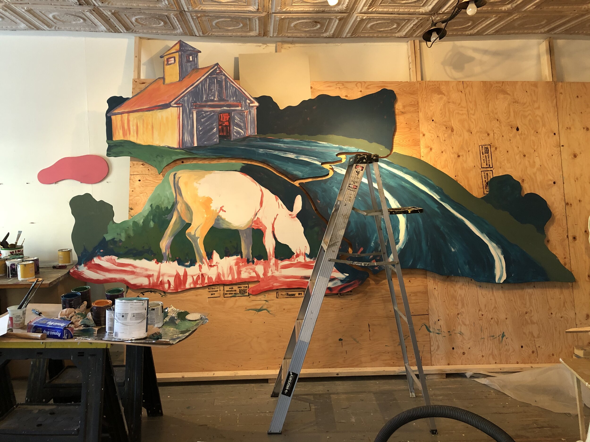
So this mural, the first of 7+ for this location, is well underway and I am nearing that point on this one of “Is it done?”. The good and the bad of a project being approved upon a concept drawing is that not all of the details are worked out from the start and that allows for more to happen and evolve as the work progresses and truthfully I enjoy this way of working, letting the painting speak to me and allowing it to surprise me. I am working with another Maine Artist on this project and we each are working on separate mural panels and that too has its own challenges in that we hope and trust they will all work as a cohesive whole in the end.
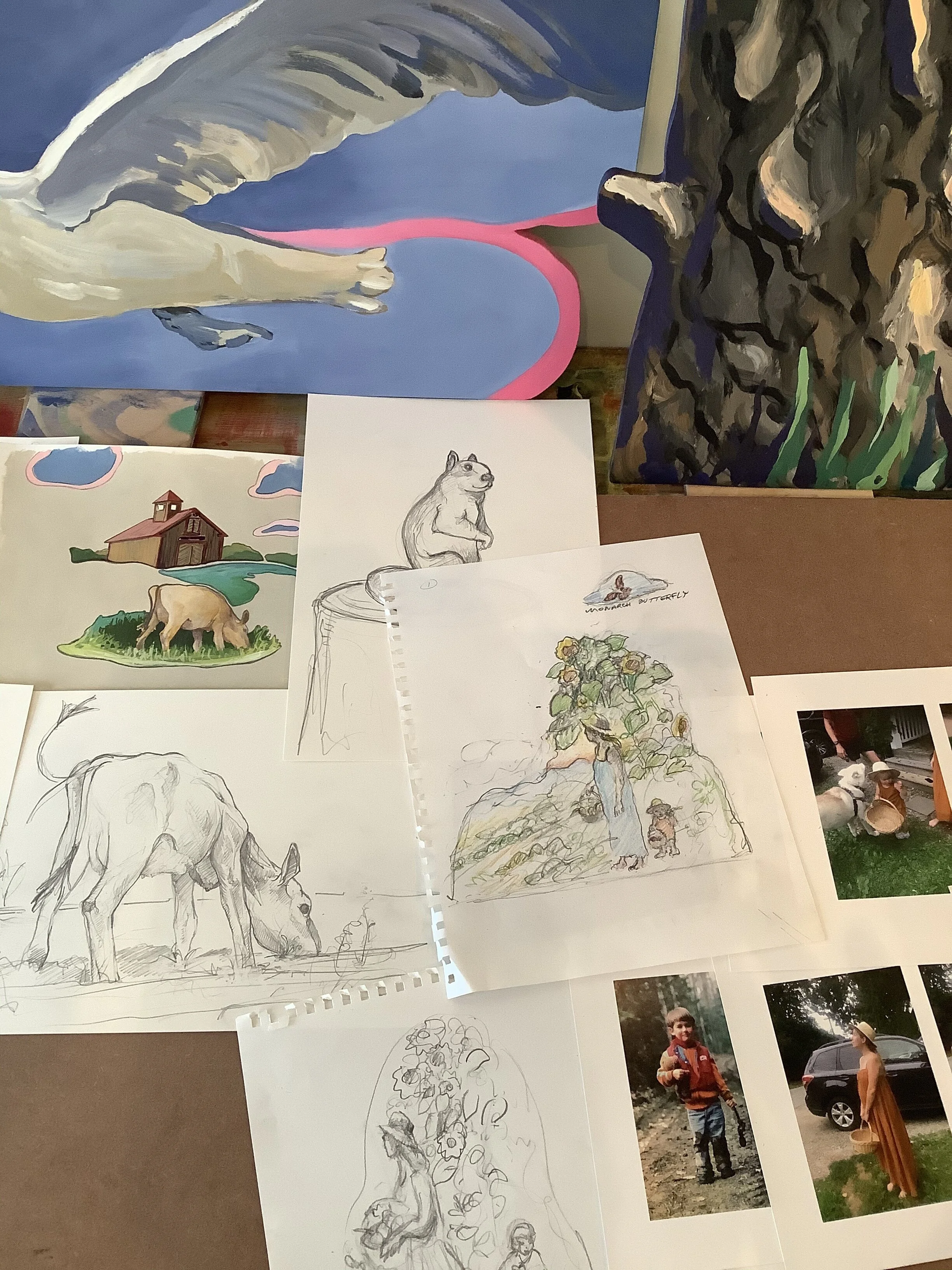
Photo from the presentation showing sketches, drawings, and images from both of us. You can see the Cow/barn scene immediately changed in composition due to a change of location for it in the building which added more wall space and its need to become larger.
As will all large projects problem solving is required and the painting on shaped panels, each from a 4’x8’ sheet of plywood, would drive the compositions. For mine I choose to look at children’s books and puzzles for I inspiration and how the panels would “work” together. I was really pleased how the cuts of each panel need up and that they would add to the overall visual composition. To fill the longer than originally planned wall for this piece I added an extra panel that created a path leading the viewer back t the barn- A welcome change that only solidified the overall composition.
Original plan for 2 large panels with cow in foreground and barn in back.

Adding the third panel really juiced the composition and helped solidify the “story”.
I used a light grid method to transfer the basic elements of the composition guiding my panel cutting. Then roughing in the major elements in a red/pink hue allows for some color play to occur knowing that my final piece would be primarily a lush green palette- Summer in Maine. I wanted to have some of the underpainting show through and activate the green palette. Overall values and composition are worked out here so that I can then focus on color and mark making, as I wanted rich and intense color to dominate the feeling of the work. I am always fascinated by the act of communicating a feeling I have when I am out and about in nature. For me color transfers this intense feelings I experience and I believe for the children and adults viewing this work that they can become more engaged with the Artwork.
To lighten the work and push it towards that children’s book feel I used stylized clouds to define the sky. I have been fascinated by the backlit clouds and the play of color when you really look closely at them. Of course I exaggerated the colors and design and these purples and pinks became the “clouds” and places to add owls and birds.
The clouds lighten the work and a swift projects off the last cloud and mingles with the next panel painted by my mural partner- A close up scene of three children, hay bails, and chickens.

Getting close!
I think it is done, but will leave the panels up for 2 more weeks as I plan my panel cuts for the next scene- This time a water view with lakes, mountains, canoes, and trees. I am pleased with the overall palette and the sense of depth I have created. Feeling as though one could walk back into the composition and enter the barn was important and the bit of underpainting in the barn interior I feel glows and invites one in. In the end I did not wish to make “Children’s Art” with this mural but ART for Children!
Initial inspiration for frame opening.
Collaborating is never easy, but always productive in the end- Whether the project is successful that is another story that only time can tell.
This large scale residential collaboration involves a 12’ w landscape painting on gilt metal leaf panels, which we will talk about in another post, and the frame that holds-ties it all together. The client is infatuated with Moroccan architecture and culture and in the end her cookbooks were especially useful in finding out what it was she loved about the particular designs and imagery. We also email often and she would send imagery that she reacts to- Sometimes in the most organized packets via the mail. In non-Covid times we would do more personal one-on-one meetings and I do miss that as the ability to understand the clients wishes and get “into her head” is difficult via the internet and a much slower process. Four months into the project and in the midst of working out the frame details I felt it necessary to build a test frame to understand some of the nuances of the overall design. I used the image above to begin, although in the end it was not quite correct in the clients eyes as the overtly circular designs were not favorable and too much of the painting was hidden. The image below was the initial “curtain idea, but lacked something and was not quite right.

Curtain design idea attempted with the frame maker that lacked the desired effect,

First pass at the opening based on the top Moroccan Arch image that I used for inspiration.

The face of the frame was to also be indicative of Moroccan architecture. . .. Pattern on pattern, on pattern. .. . . . I use a raised stencil technique and am drawing out designs here to see if it works.
The use of stencils in my work is one I have worked to advance over the years. I can and do carve wood at times, but the raised stencil to me is more “hand” made and an extension of my love of drawing + painting. I tend to draw quickly and loosely my designs and then allow the stencil cutting to be loose and free, not trying to copy those drawings lines- They are only guides for the final stencil pattern.
Stencils can by Kitsch for sure, but used as a tool with other tools it can become part of a process that is I feel has wonderful possibilities!

First pass at cut out “curtain” frame with applied raised plaster stencil design.
In building this mock-up I worked quick and loose (Pretty much finished the frame in one day). I did not want to get tied up in construction methods as that can be solved later and would only hamper the creative process. This was a 3-d sketch of the frame- I applied raised plaster designs as well as wood fillers to create interesting edges allowing areas of the frame to sit proud of one another or recede. All of this was to allow for the final metallic glazed finish to have extraordinary details through a rub-off process. See the image below for final finish.

Layers of metallic copper were buried under a rich dark glaze and revealed as necessary.
In the end the circular based opening was not the right direction, but the overall feel was on track minus a few things here and there. The two medallions were not a hit, but I admit they were a bit clunky and did not translate well. As in all sketches some things can and will be taken to the next level and some will be discarded and that is okay.
I will discuss the final drawings for the openings and that process soon in another post as I am still working closely with the woodworker on the details- I will say that as I hit “publish” on this post the frame with its approved openings has been completed and will be delivered today! Yay!

Interior of Main Room of original house showcasing the incredible woodworking and stonework.
This 1929 Prentice Danger designed Lakehouse is a window to the past and the new owners have looked to update without disturbing the history and feel of the home. A love of William Morris led to this raised plaster decorative finish of a well known wallpaper design.
Read more
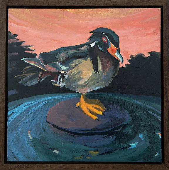
Mallard
Something The Birds Told Me - Odd Ducks
“Something The Birds Told Me” is a series started over five years ago, that as many of my series do continues as inspiration hits. These “Odd Ducks” have been in the works for awhile and one even was shown in a previous state early in 2020, but alas they are ready for their group unveiling.
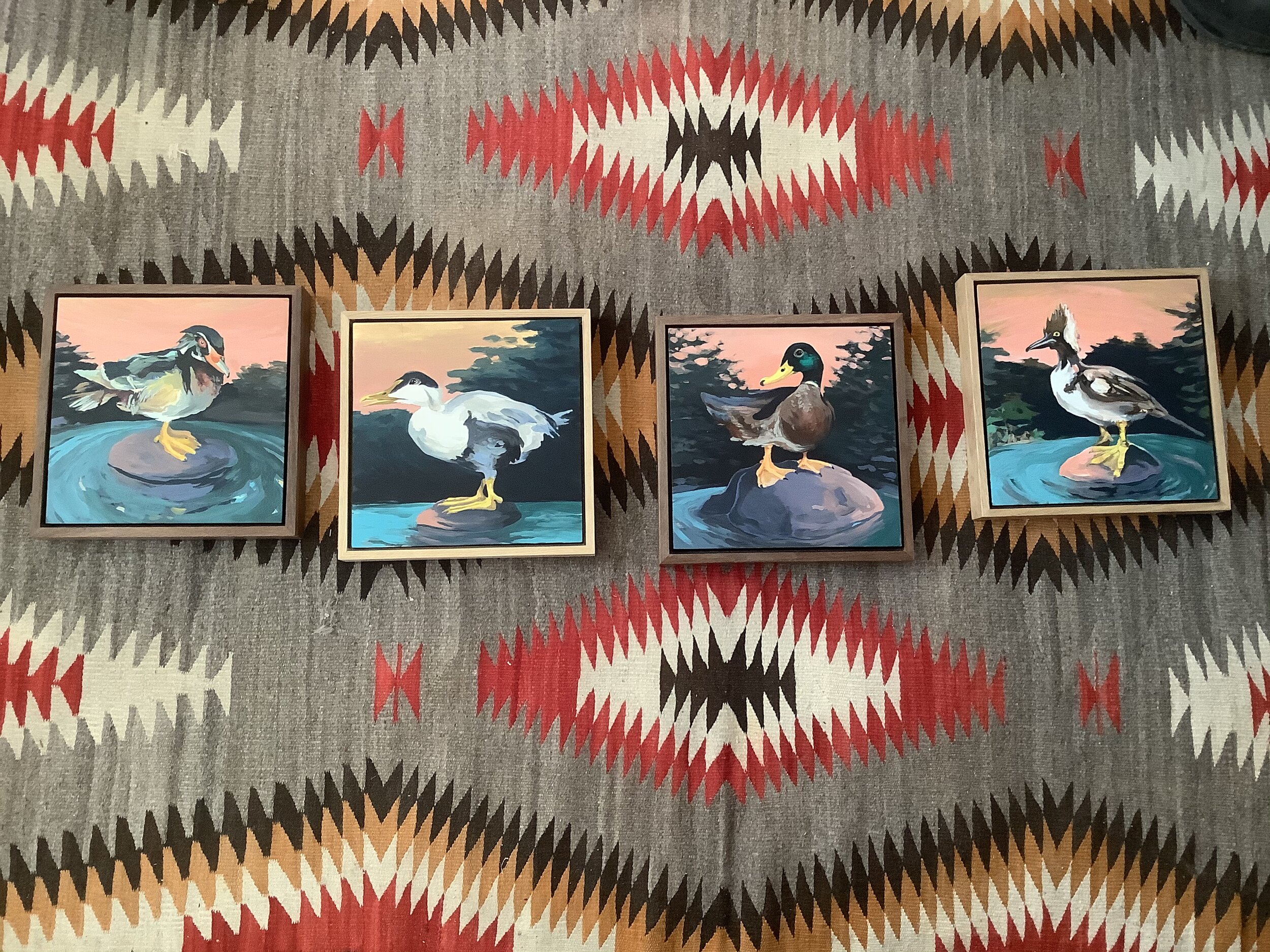

Buffle
Head
Something The Birds Told Me - Odd Ducks
Usually these birds are isolated, alone, and appear to be contemplating something more than is apparent in the frame. For most they are stranded on an island of their own with rising water surrounding them- At least that is how I see them.
The Odd Ducks are a little different in that they sit closer to shore. They also, at least in my minds eye, resemble birds in a natural history museum, specimens if you will.

Eider
Something The Birds Told Me - Odd Ducks
My friend Earle makes all of my wood panels for me and with these new ones he includes hardwood frames which at first I was unsure about, but I do LOVE having the piece framed from the start! I may have him make paint grade ones next but the wood works great for these pieces I think. Always a process- Making, finishing, framing, and exhibiting works. . . . ..
Wood Duck
Something The Birds Told Me - Odd Ducks